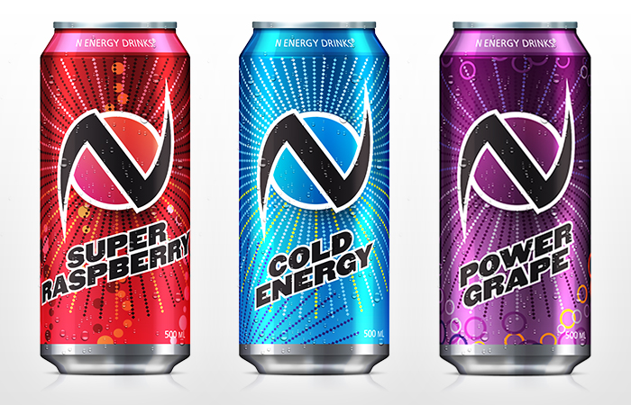
Three of the four N Energy drink cans that I created.
N Energy is an energy drink brand that was designed by Piculia Design. The brief aimed for an eye-catching design for four flavours of the energy drink. It needed to stand out in a drink fridge. The logo is designed with the ability to change colour based on the flavour of drink that it appears on. This also means that, should the company hold any promotions or sell limited-time only flavours, the logo can easily adapt to a new can design.
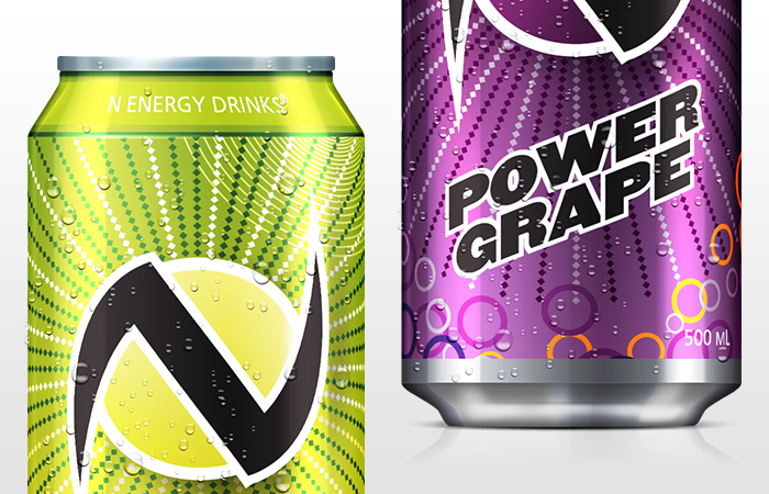
Close-up of the top and bottom of the cans.
Each can needed to be easily identifiable as both an N Energy drink, and a different flavour. The strong colour schemes of each can allows both of these objectives to be met. In addition, each can design has elements that extend this differentiation. For example, the Power Grape cans use coloured rings as a decoration, while the Spirit Lemon can uses thin spirals. These small details help to separate each flavour from one another.
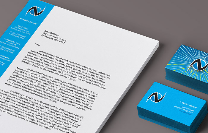
Business cards and letterhead mock-up.
In addition to the can designs, branded stationery was also a part of the brief. It was decided that the Cold Energy colour scheme would be the primary colour scheme for use across branding materials and other design applications.